

Last Updated: May 21, 2023
The success of DeFi platforms depends on the amount of capital that is deposited as loan collateral or liquidity in trading pools. Total Value Locked (TVL) is an important metric to measure the impact of this capital on a DeFi application’s profitability and its usefulness to traders and investors.
As the TVL of DeFi platforms increases, so does its liquidity, popularity, and usability, all of which are essential to its success. Higher TVL indicates more capital is locked in the protocols, allowing users to gain more substantial benefits and returns. Conversely, a lower TVL leads to fewer funds available, thus decreasing yields.
DefiLlama is the go-to platform to analyze movements in TVL and come to conclusions about what to expect next in the crypto markets.
On this dashboard, we can find the Total Value Locked (TVL) on different chains, a ranking of the protocols that run on them, and multiple filters to gain insights about their token supply.

This graphic shows the TVL line chart, value locked in USD, change in TVL over the last 24 hours, and which protocol dominates TVL percentage-wise.

Users can decide what to include in the TVL, like how many tokens are Staked, paired with another asset in a Liquidity Pool, tokens borrowed in lending protocols, Double Count tokens (TVL of one protocol that integrates into another), Liquid Staked assets, and Vesting tokens (token unlocks).
All this data can be evaluated for all supported chains or specific ones.

Here we have the TVL ranking of all the protocols that are integrated into DeFiLlama. These can be bookmarked to be displayed on your Watchlist. The list shows into which category it belongs (e.g.: DEX, Yield), on which Chains it’s operating, TVL change in 1 day, 7 days, and 1 month, TVL of the protocol, and the market cap of the protocol’s token relative to TVL.
When you click on a protocol off of that list, DeFiLlama will provide additional data regarding the TVL, how it is spread across supported chains, a line chart for TVL and market cap, and major events within the crypto space to give context to previous TVL movements. The chart can be shown in Dollar/ETH terms.

A convenient link to the smart contract code can be found here. The competitors of a protocol and their respective TVL, and how much money was raised previously for the project.

Discrepancies in generated fees and the respective revenue could have two reasons.

Here we are observing the TVL charts of Aave, trying to find clues about what could happen next regarding prices of crypto assets.
These TVL charts show how much value is locked on supported Chains, how many Tokens are locked, the respective value of the tokens in USD, and in and outflows measured in USD and the number of tokens.
$2.97b in ETH has been withdrawn from the protocol! A few days later ETH topped out and is in a downtrend ever since.
Watch out for large movements in TVL and compare those to past price action to come up with actionable insights for the next time they occur, make a backtest now fellow degen!
Here we can see information about how TVL is distributed across chains, and a ranking system to measure usage for each of them.

We have the usual suspects on top of the screen when it comes to filtering the data. Also a pie chart and a line chart, plus a filter for the 155 chains supported by DeFiLlama. Also, a button to download the provided data as a .csv-file.
Liquid-staked assets tend to lose their peg in sell-off events, they usually defend their peg over the long term, since they should be backed one-to-one with the underlying asset.

The ranking allows users to filter chains by Non-EVM, EVM, Rollup, Cosmos, and Parachain. Chains can be ranked by the number of protocols that run on them, daily, weekly, and monthly changes in TVL, the amount of stablecoins on them, their daily volume and fees, Mcap/TVL, and of course their overall TVL.
An airdrop farmer’s wet dream! Never has it been easier to find tokenless protocols that might airdrop, while at the same time having tools to increase the likelihood of receiving a valuable one!

The list allows users to see to which category a protocol belongs, on which chains it’s being deployed and since when, how much money was raised previously, and TVL changes on a daily, weekly and monthly basis. There are also filters for chains and min/max TVL, as well as a function to hide forked protocols.

Treasuries, and how DAOs and founding teams spend them have become a subject of increasing interest, and scrutiny. Whether its people cricitizing the Arbitrum Foundation for dumping ARB, or allegations against Aragon DAO for treasury mishandling, it never hurts to keep tabs on treasury values, and the tokens that make up these valuations.

DefiLlama’s dedicated Treasuries tab displays information on total treasury values, in addition to category values, including stablecoins, the protocol’s own tokens, others, and major crypto assets. This could come in handy if, for example, you were considering minting, buying or interacting with a certain stablecoin; you’d hope a large portion of the project’s treasury would be in stables, or perhaps the project’s own tokens, as opposed to “Others”.
Oracles are a crucial part of DeFi infrastructure. They connect blockchain applications to “real-world” data, provide price feeds for financial markets, and ensure that smart contracts work as intended. But they can also become an attack vector for price manipulation with the intent of extracting value, leaving users of, for example, lending protocols, rekt.

As we can see, Chainlink is dominating by all metrics, and it’s not even close. It is the most secure oracle thus far. It is the de facto gold standard! I don’t see much room for any kind of rotations here, but if another oracle would gain serious ground versus Chainlink, or something entirely new is created that gains traction, I would pay very close attention!
Forks are copies of smart contract code, this can happen in a friendly or hostile manner. Whenever a new DeFi primitive is created, there will be forks, lots of them. Not all forks are created equal! There are basically three outcomes for a fork, the good, the bad, and the ugly.

These charts show us some comparisons when it comes to Fork dominance.
You can filter the data, and then sort by # of protocols, TVL, and even a ratio of Forks TVL to Original protocol TVL.

Furthermore, we can see what the most popular forks of the protocol are. For Uniswap, we see PancakeSwap as the most popular fork, even surpassing SushiSwap in TVL multiple times over.
You can see the dominance of Pancake is ~49%. You can also use this page to spot trends with the TVL chart, showing the popularity of forks in certain time periods.
A list of the protocols with the highest TVL within their category, for all the chains that are supported by DeFiLlama. Here you can find information on the best protocol to use for a variety of situations, on many different chains. Looking for a great derivatives platform on Optimism? DefiLlama recommends Perp Protocol. Or maybe you’re looking for a yield aggregator on Solana… DefiLlama recommends Mercurial Vaults.
This dashboard gives us the ability to compare two or more protocols TVL to one another. We do have the usual filters of what to include in the TVL available (Staking, Borrows, Pool2, etc.).

Ever wondered how projects are utilizing investor funds, or if they’re putting the capital they might receive from dumping tokens to good use? The Protocol Expenses page gives you the latest publicly available information on a project’s headcount and the amount spent on staff salaries. It also provides a source for the information. Keep in mind that this info is only available for a select number of prominent projects at this point in time.

Ranking of protocols by the value of native ETH within their TVL.

We can see Lido and their liquid staking lead by a good margin, with $5.7b of ETH on their platform.
This dashboard provides a good overview of the different types of protocols, and users can quickly see which sectors of DeFi are the biggest and most important ones. Very informative for DeFi novices.

Here we have our usual filters for staking, borrowing, etc., and the line chart allows us to easily see how TVL is moving in the different sectors, which can also be filtered for better visualization.

The major categories, how many protocols fall within them and what their combined TVL is, and a brief description of which function they fulfill. Very useful for beginners to get familiar with the DeFi primitives.
In this section, we can find the most recently listed protocols, on which chain/s it has been deployed, to which category it belongs, and their TVL and changes in it.

We have the option to filter by chains and hide forked protocols. The filter for min/max TVL is quite useful to find protocols that already have gained traction.
This dashboard displays Total Value Locked by the programming language in dollar terms and by dominance. Solidity, the programming language for the Ethereum Virtual Machine, dominates by 90%. This data allows us to conclude that most developers are working on EVM-compatible blockchains, hence it is likely that innovation and adoption will happen on an EVM chain.

The dashboard also includes a chart depicting the growth in the ratio of open-source projects to closed-source projects built on Solana.

Here you can filter by tokens, chains, project, project category, attribute (stablecoin pool, single asset pool, etc.), minimum or maximum TVL, and APY. Entries include a link to the specific projects’ pools page.
2 additional toggles allow you to see 7-day IL (Impermanent loss) and 7-day Base APY.

Further, you can sort entries by their APY (combines the Base APY and Reward APY), Base APY, or just the rewards APY. Sorting by the 30-day average APY is also available, with a quick view chart showing 30-day performance.

It should be noted that APY is actually APR for non-auto-compounding vaults; DefiLlama does not count for reinvesting.
A good way to use the pools page is to choose the specific tokens you want to earn yield for. Doing this can include derivatives of those tokens, such as liquid staking derivatives (LSDs). This way, you’re not missing out on even more yield when filtering for your favorite L1 that you want to stake. You can also add other parameters like chains, type of project, attributes of pool, etc. to narrow down your search. Alternatively, you can use these and exclude the token filter to search for the best yield opportunities in general.
Users can then sort by the APY, to see the highest APY pools first. You can filter by Base APY as well if you prefer “real yield” over protocol token incentives.
On top of this, you can filter by a minimum TVL, so that you can see trusted pools from larger protocols. This reduces smart contract risk that you might take on if you were to enter a pool with high APY, but that hasn’t been tested by many users yet or is from a project you don’t know much about.
Delta is the difference in price movement between an asset, and derivatives based on that asset, for example, options.
Going Delta Neutral (DN) is a way to offset risk or exposure to specific base tokens. This can be helpful if you just want to take advantage of yield opportunities but don’t really want to hold the assets required to earn these yields.
On the DN page, you can specify the token you’re borrowing (optional), the token you’re borrowing against (collateral), and the maximum Loan to Value Ratio (LTV) %.
One good example of how you could use this DN page is to make a play around shorting a stablecoin that is above peg. One such stablecoin is LUSD: if you aren’t familiar, LUSD is an overcollateralized stablecoin backed by ETH on the Liquity platform (read our breakdown here).
LUSD has been significantly over peg for many months; if you wanted to take advantage of this, you could enter LUSD as the token to borrow, most likely with ETH as collateral. If you think LUSD will return to, or even go below peg, you could swap for another stablecoin, of which you would receive more. Then, when LUSD gets closer to the 1.00 peg, you could pay back the loan, keeping the extra money you got by selling LUSD when it was above peg. You could also use many other platforms to short ETH if you don’t want to be exposed to ETH when taking advantage of this opportunity. Shorting ETH just allows you to take advantage of this LUSD strategy without being exposed to ETH, making it Delta Neutral.

As we can see above, there are other strategies involving LUSD, which DefiLlama even explains briefly when hovering over the strategy.
Good DN opportunities might be hard to source. With this dashboard, you can find specific DN opportunities for tokens you’re interested in, or find new opportunities by filtering by tokens, chains, project, project category, attribute (stablecoin pool, single asset pool, etc.), minimum or maximum TVL, and APY. Entries include a link to the specific projects’ pools page.
Leveraged Lending or “Looping” as some people call it, is a way to gain even more yield on top of the normal APY a project gives for supplying assets. Leveraged Lending naturally has a lot more risk involved than typical lending, as you open yourself up to being liquidated. But with this risk can come great reward!
The way Leveraged Lending works is by taking your normal deposit into a lending protocol and earning a yield, but then also borrowing against your deposit, and then depositing your borrowed funds right back into the same pool.

In the data toggles, you’ll see the original Supply APY, and then the higher Loop APY that can be achieved with Leveraged Lending. The 2nd strategy on this list gives 7.87x more yield for looping… with the DAI stablecoin! But of course, there’s always risk that comes with reward. We can see the LTV ratio is 95%, meaning you could borrow funds worth 95% of what you deposited: this is very high, even for stablecoins. We can also see that there isn’t very much liquidity supplied or available for borrowing, which limits the amount of funds that you could use this looping strategy with before the APY lowers.
You can use these toggles to prioritize what matters most to you: maybe you just want to Ape in and don’t care all that much about the risk. Sort the data by highest Loop APY. Or maybe you’re a whale looking to find pools that have enough liquidity for you to comfortably Loop; sort the data most liquidity available for borrowing.
You can use the search feature to specify what tokens you want to find a looping strategy for and specify the chains and projects that you would want to deploy on. You can even specify attributes, such as viewing only audited protocols (if you want to stay safe!) or excluding protocols with bad debt, as we’ve seen this be an issue with many attacks on lending protocols.
In the last bull market, there was a popular looping strategy involving UST on Abracadabra. While this was clearly unsustainable, you can still find leveraged stablecoin lending opportunities using safer stablecoins, like USDC.

Here we’ve specified that we want to find Leveraged Lending opportunities on USDC, and we’ve sorted by most funds available for borrowing, to ensure that these strategies have a lot of liquidity, which means they are probably much more sustainable and safe than more degen looping strategies.
If you think Leveraged Lending is too risky for your taste, you can also find great information on just normal borrowing and lending. The Borrow tab shows the basic information on supplying, such as the interest you can earn for supplying assets, and any incentive APY the protocol providers for lenders.

For Borrowers, it shows the interest you will have to pay back on your loan, even if the protocol pays YOU to borrow. You can sort the data by supply or borrow rates, LTV Ratio, and the amount of funds supplied, borrowed, or available for borrowing depending on your preference.
And of course, you can search for the specific token you’re interested in borrowing, or just filter by chain, project, or other attributes, such as if you only want to see stablecoins, or protocols that don’t have bad debt.
This Yields Overview page gives you a good look at what yields crypto has to offer across ecosystems.

The chart displays data of the Median APY and the 7-day average APY of the past year, so you can notice important trends for the assets and chains you care about. Some people see high yields as a sign of greed in the markets and can use this tool to help them form an opinion on whether the market is too frothy.
With this dashboard, you can also filter by the token you’re interested in, the Chain, project, project type, TVL, APY, and other attributes. There is data available for many different tokens across the chains.
For example, if stablecoin yields are very high, this could be a sign of euphoria in the markets. People think that they can trade or borrow against their stablecoins for other tokens, and easily make a quick return. Because of this, protocols may find they have to provide high yields and token incentives to get people to actually provide stablecoin liquidity. While a thesis may sound good in your head, it’s always best to get another opinion: solid data via the Yields Overview APY trendline is the best way to get an unbiased opinion to help you develop your APY pattern recognition!
Speaking of stablecoins, the Stablecoin Pools dashboard is a great way to get in-depth data on the liquidity and APY opportunities available across crypto.

Here you can find pools for both single-sided or dual token liquidity. With stablecoins, impermanent loss usually isn’t that big of a deal… if you trust the stablecoin you’re providing, that is.
You can filter via Chain, project, TVL, APY, and even opt to show the 7-day Base APY and 7-day impermanent loss.
You can sort the data by TVL, APY (both the base APY and the protocol token incentives APY), and the 30-day average APY. It even gives you a handy chart of the latest 30-day APY so you can see if there have been any large spikes or dips that should be aware of.
With this dashboard, you can find the safest possible places to earn a yield on your stablecoins and escape the volatility of the market. To minimize risk as much as possible, you can choose to only see liquidity pools with high TVLs from the most trusted protocols, to make sure your money isn’t too vulnerable to smart contract risk. Staking stablecoins can be a lot more lucrative than holding money in the bank, but it’s always good to do your due diligence with the Stablecoin Pools dashboard before apeing in!
On the Projects page, you can get a look at some of the general yield info on ~200 of the most popular projects.

Here you can see the category of protocol, the amount of pools it has to deposit for yield, the total TVL, whether or not it has been audited, and the Median APY across the protocol.
You can sort by these metrics to prioritize your needs. Maybe you want only the highest TVL protocols, sort by TVL, highest to lowest. If you want a versatile protocol with many different pools and assets to choose for yield, you can sort to view projects by the highest number of pools first.
Do you practice Islam? One common issue for those practicing Islam is finding protocols that meet their needs, as some of the common tools offered in DeFi are actually Haram. For example, Riba, which refers to charging interest for borrowing, is often considered Haram, as it involves an unfair exchange between the parties. This would qualify many lending protocols in DeFi as Haram!
This can be a problem for Muslim users who want to engage in DeFi but don’t want to accidentally compromise on their beliefs. As a tool to help solve this problem, the DefiLlama team developed the Halal dashboard, which can be used to filter out protocols that could be considered Haram. Here is their methodology for deciding what is and isn’t Haram, as interpretations of Shariah-Compliance could differ depending on who is asked.

The dashboard allows you to filter by token, chain, project, project type, TVL, APY, and other attributes. You can also choose to have 7-day Base APY and 7-day Impermanent Loss shown. You can sort by these features as well based on what matters to you most when searching for yield.

DeFiLlama Swap is an integrated DEX aggregator, built right into DefiLlama. If you’re scouring through DeFiLlama dashboards to find on-chain opportunities, having an accessible way to swap tokens from the DeFiLlama platform just makes sense.
The main reason to use the aggregator is that it automatically will find the DEX that gives the best price for your trade. DeFiLlama will route the trade through this DEX, giving you the best bang-for-your-buck, without you ever having to navigate to the DEXs native UI. Considering the notoriously poor UI/UX of crypto, it is especially helpful to have many DEXs available through one UI, right on the DeFiLlama site. Just check out the simple UI below; it certainly looks better than Curve!
It’s also worth noting that DeFiLlama does not charge any additional fees for their aggregation, a feature that differentiates the platform from other traditional DEX aggregators.

If DefiLlama doesn’t tack on any fees for aggregating the best prices for you, how do they profit? Well, they use their referral code automatically into their aggregator UI, so they earn a slice of the original DEX fee. This purely benefits DefiLlama, the fee for using the DefiLlama UI is the same as it would be if you used the actual DEX that DefiLlama chooses to route the trade through.
DefiLlama seems to enjoy helping DeFi users have the best crypto experience possible; as despite using their ref links for DEX swaps, they also have included DEXs in their aggregator that have no ref link for DefiLlama. Swaps that route through these DEXs also have no additional aggregation fee; the DefiLlama aggregator will give you the best price for your trade, even at their expense.
One last thing to mention; if trades route through a DEX, your wallet will be included in any snapshot the same as if you had made the swap yourself on the DEXs native UI. This means you will be eligible for any potential airdrops from DEXs launching a token, without ever having to actually use the DEX, assuming the DEX provided the cheapest price for a trade you made through DeFiLlama Swap.
Of course, the goal of DeFiLlama Swap is to get you the best price, so aggregation does not prioritize routing through DEXs that have a higher chance of airdropping, but this is just another neat feature of the service.
The DefiLlama Collections page shows you the top NFT projects, based on your sorting preference.

You can sort based on daily or weekly price change, daily or weekly volume, the daily number of NFTs sold, and number of NFTs in the collection listed for sale. You can also sort by floor price, and total supply, although these options are probably less handy.
The Marketplaces dashboard allows you to see some pretty insightful metrics of the top NFT marketplaces. At the top, you can get a visual view of how the go-to marketplaces compare when it comes to volume and number of trades.

You can also view the data in relative format, to see how the marketplaces compete for total NFT market share.

If you want more specific data, you can sort through the marketplaces based on daily or weekly volume, weekly volume change, % of market share, and the number of daily and weekly trades. DefiLlama even shares with you what percent of trades on a given platform are wash trades, information that is especially relevant as some NFT marketplaces bootstrapped NFT liquidity by providing fee shares via token staking. This significantly increased wash trading on platforms like Looksrare; below, we can see ~56% of trades on the platform are attributed to wash trading!

Being weary of inflationary tokens is one of the most common traits among DeFi veterans. DefiLlama’s Unlocks page can help you decide if a token’s given inflation rate is too much.
You can sort through projects based on token price, market cap, max FDV/ max token supply, total % of tokens that are still locked, and value of tokens unlocked per day.
The page also features information on the next event that involves a large-scale unlock, if applicable; one strategy you could employ is to just sort by “Next Event”, in ascending order. This way you can see which tokens will have a catalyst coming soon. If you think the unlock event is significant enough to impact the token price by a lot, you can look to short the project’s token. Or maybe you can look to scoop up a deal after the price falls if you are mid or long-term bullish on the project, or if you just expect a price rebound.

The Borrow Aggregator dashboard serves as a way to compare what platforms provide the best lending services for your borrowing needs.
You can specify what type of borrowing you’re looking to do by providing tokens used as collateral, and tokens you’re looking to borrow. You can also specify the max LTV % you are comfortable with, in case you see certain tokens being risky if they have low collateral requirements.
For example, Lodestar Finance was recently exploited (which you could’ve been aware of by using the DefiLlama Hacks dashboard!)
Wait… ur telling me plvGLP had a higher LTV than FRAX, DAI, USDT, BTC & MIM?? Equivalent to ETH??
Shitty risk params strike again pic.twitter.com/dVY1nFjk5y
— Barry Fried 🇮🇱 (@BarryFried1) December 10, 2022
Here, Barry Fried criticizes the LTV requirements for plvGLP; this is interesting in hindsight but is even more important information to have in your arsenal before using a protocol. This is where the Borrow Aggregator can help you do more due diligence when posting collateral and borrowing in DeFi.
The dashboard also shows the APY you can earn for lending or supplying assets, and the APY for the cost of borrowing. Taking these into account as well as the LTV ratio, DefiLlama gives you the Net APY for borrowing.
The dashboard gives you information on how much money is being lent or supplied, compared to how much is actually being borrowed so that you can decide if you are comfortable with the utilization rate.

This listing allows us to check the balances on centralized exchanges, how many of their self-issued tokens are held by them, who the auditor is, when the last audit took place, a link to that audit, and a link to the wallets associated with that exchange.
If a bank run on an exchange is taking place, you could recognize it early with this dashboard.
If you are serious about crypto, avoid centralized exchanges at all costs. Your assets are safer and more useful on the blockchain, but please, use a hardware wallet!

Volume data for the most used bridge protocols, is quite useful to find safe and reliable applications for bridging funds between chains.

The chart shows us how much value is being processed by the different protocols. On the left, we can see the dollar value of bridged assets in their respective timeframe. As we can see, there is not a lot of value being bridged at the moment.

A comprehensive list of bridge protocols, which chains they are connecting, daily, weekly, and monthly volume, and the number of transactions in the last 24h.

Speaking of whales, the large Txs tab allows for sorting by value and provides an explorer link, which enables us to go whale watching, and see what smart money is doing on-chain. But on-chain analysis is a topic in itself, and we leave it at that, for now.
A detailed breakdown of the capital flowing both into and out of the most important blockchains.

In this picture, the blue bars represent the Ethereum network, while the green bars represent Polygon. The data doesn’t extend to a long period of time yet, but we can still make some deductions from it.
The reason for that could be that ETH leads the prices for smart contract blockchains
anyways, also Polygon announced a major partnership around that time.

The list enables users to quickly identify which chains have experienced an increase or decrease in Total Value Locked (TVL) over a period of 24 hours or 7 days. Use that information to find narratives or to check on the health of your preferred chain.
Allows users to generate a .csv file for bridge transactions. Just enter a start- and end date and for which bridge the data should be generated. A useful tool to backtest chain rotations.
DefiLlama’s Governance page allows you to view, and discover projects based on how active their community is when it comes to project governance. Project governance can be a great way to evaluate market conviction in a project; both retail and institutions are much more likely to get involved in submitting or voting on proposals if they have a long-term view of a project’s success.
You can sort through the list of projects by the total number of proposals, the total number of successful proposals, and total and approved proposals in the last month.
Here we’ve sorted through the projects based on successful proposals in the past month, in descending order; this shows which projects have both ample governance interest, but also have the ability to implement positive changes. Governance means nothing if it just results in gridlock…

If you ever wanted to know what price has to be reached to trigger one of cryptos famous liquidation cascades you came to the right dashboard! And you can even gain an advantage from these occasions!

The dashboard shows you the total value of liquidatable assets, which can be switched on the top left. Also how much value could be liquidated if the price of an asset declines by 20%? The chart illustrates the price point that will initiate liquidations and the amount to be liquidated.
This works better in bull markets since participants are way more risk-on while 20-30% corrections are normal in the crypto market, use this knowledge to buy the f’ing dip when the bull returns!

The 24h change in liquidatable assets enables you to estimate how risk-on or risk-off participants are.
The liquidatable amount per protocol is an indication of how dominant and hence how trusted a protocol is. To gain a sense of the level of leverage in the market and how likely a price correction is, use the amount within -20% column. These are the bear market metrics, come back to this when the bull market has returned and compare the numbers!

Shows you the number of tokens and their value, and at which price a liquidation will be triggered. The largest position has a relatively safe liquidation price which makes it less likely that a cascading liquidation will reach this price since it locks a noteworthy amount of ETHs supply.
This dashboard enables us to monitor the total value of trading on decentralized exchanges and see which decentralized exchanges are the most popular ones.

The total volume over the past 24 hours, as well as the changes within the last 24 hours and the last 30 days, can be observed.

The typical daily, weekly, and monthly changes in volume; the volume over the course of 24 hours and the total volume.
Having oversight of the respective volume on blockchains can provide a substantial edge when it comes to spotting market turns.

Let us have a look at the local top around May ‘21 this time. The data shows that there was more trading activity/volume on BSC (called BNB-Chain these days) than on Ethereum on some days.

A similar picture is to be seen in October/November of ‘21. This time volume was more scattered because there were more ecosystems to play with. Still, this marked the top of the cycle, but since this was the first cycle with that many functioning ecosystems it remains to be seen what will happen next time. History doesn’t repeat itself, but it often rhymes.
My guess for spotting a potential bottom with these indications would be seeing volume almost dying completely on alternative Layer1s, and I think we are almost there! The question is, which chains will survive afterward?

The dashboard includes the usual stuff like volume, TVL change, etc. What’s important here is the % of the total, if Ethereum loses substantial market dominance in this column, and we just had an extended up move, consider swapping some of your volatile tokens into stable ones!
This dashboard allows you to see an expansive list of the fees that both blockchains and the protocols built on blockchains have earned.
You can filter the expansive list of fee-generating chains and protocols by category, which prioritizes either actual chains or on-chain projects.
Most importantly, you can filter by highest or lowest 24hr fees, which represent the total fees taken by the project or blockchain. You can also filter by 24hr revenue, which specifically gives you the net fees earned that go to either the project treasury or token holders.
DeFi degens hate ‘getting dumped on by the VCs’. VC investments are an important driving aspect of the crypto market, whether it’s bearish unlocks, or bullish funding rounds in a new sector that could raise prices across an ecosystem. This dashboard lets you keep track of all these capital inflows, and see information on each individual raise.
As many of us know, one of the many crimes SBF has been accused of is pumping and dumping tokens, specifically in the Solana ecosystem. If you want to be very cautious, you could search for FTX AND Alameda VC investments, to make sure you don’t get caught up in any ‘Sam’ tokens.
This is just one use case for the Raises dashboard.

You can specify the time period of the graph displayed here, to show how capital inflows have trended in specific times.
At the top, you can search specific investors or institutions to see all the deals they’ve participated in. This allows you to discover new projects if you’ve perhaps identified investors whose investment thesis aligns with your own. And of course, it lets you check for projects funded by investors you are cautious of…
You can filter the funding raise data by what type of raise it is, for example pre-seed, ICO, series A, etc. You can also filter by the sector the project is building in, and by what specific investors were included in the round. The amount of funds raised and what chain the project is on are also available options to filter with.
DefiLlama then gives you important data, including the amount raised, the lead investor, other investors in the round, and even valuation if available.
You can also submit funding round information to the DefiLlama team.
The Stables Overview page shows you a general look at what is going on in the world of stablecoins: you can see current USDT dominance, the weekly stablecoin inflow or outflow %, and the total stablecoin market cap.
The Chart lets you analyze the specific proportion of significant stablecoins per day, spanning back to March 2021.

Beneath, you can use the filter and sorts to find the best stablecoins on specific chains, see capital flows on a 24hr, 1-week, or even 1-month basis, and even see how above or below peg specific stablecoins are.

Stablecoins are one of the few ways to mitigate a lot of risk in the volatile world of crypto, but they’re not without their risks. You can use this dashboard to make sure you’re using a reliable stablecoin, and use the capital flows data to gauge how secure the market thinks individual stablecoins are.

The Chains Stablecoins sub tab lets you see more chain-specific information on stables.

Here you can see what amount of stablecoins are on ETH, and use multiple charting options available to see how ETH fares compared to other chains when it comes to % of the stablecoin market cap.
Beneath, you can see a list of chains, with options to sort based on stablecoin characteristics, including Stables market cap, total market cap issued on, 1 weekly stables amount change, how much stables have been bridged to the chain, and even the Stables market cap/TVL ratio.

The dominant stablecoin along with the corresponding % is also given. You can use this information to decide what stablecoins are best when deploying onto new chains and see how reliant a chain is on any particular stablecoin.
The “Filters” bar even allows you to aggregate data from sub-chains, for example, subnets on Avalanche, L2s on Ethereum, or parachains on Polkadot. This is an important feature as the DeFi world is expanding, with many sub-chains being launched which are taking more stablecoin market share.
One big problem for the Cosmos ecosystem was that it primarily used the now-defunct UST as its main stablecoin.
To keep tabs on individual Cosmos chains, like Kujia, you can see the Chains’ personal dashboards here.

Obviously, Kujira isn’t using UST. Instead, they’re using their own stablecoin, USK, which is fortunately above peg! It’s a good idea to check up on Chains you’re interested in to view stablecoin inflows and outflows, peg health, and stablecoin dominance.
While going on-chain may protect you from CEX risk, unfortunately, there is still smart contract risk to be wary of. Fear not; DefiLlama’s Hacks dashboard, which is updated pretty quickly, can help you be aware of protocols and concepts to avoid when navigating DeFi.

You can see “Total Value Hacked” information, as well as use the graph to observe TVH trends over specific timeframes.
More importantly, the dashboard lets you see the most recent hacks and exploits, the amount of funds lost, and even information on the attack vector used in the exploit, so you can pick up on patterns on what features are present in a protocol that you might want to avoid.
Entries even give a helpful link to learn more. This Lodestar Finance exploit links to a detailed thread, so you can learn more about the hack and stay up to date.
@LodestarFinance on Arbitrum has just been exploited 🚨
The situation is still developing and post-mortem is still ongoing, but it looks like the entire protocol has been drained so far. That would represent a $6.9M loss. pic.twitter.com/cOnFBtV2an
— BowTiedPickle.eth | Solidity Shipper (@BowTiedPickle) December 10, 2022
DefiLlama’s ETH Liquid Staking dashboard lets you see how the various Liquid Staking Derivatives (LSDs) are competing against each other at any given time.

The pie chart on the left shows who takes the majority of the~16B ETH LSD market share; for the most part, the ETH LSDs scene is still dominated by Lido. On the right, we can also see how the competition has changed, and what protocols have gained and lost market share over time.
You can also filter this information based on the specific LSD protocols you want to see. By default the charts include all 19 LSD providers.
Below, you can sort through the LSD providers based on amount of staked ETH, TVL, weekly and monthly TVL change, % of market share, ETH peg deviation, market cap to TVL ratio, and staking APR. The page also shows you the LSD token for each project, if you would like to take a position based on the metrics provided.

The DefiLlama Chrome extension can make your DeFi browsing experience a little more convenient, and safe. There are 2 main use cases of the extension:

LlamaNodes is a free, public blockchain RPC that DeFi teams can use, rather than relying on industry-standard RPCs. There have been concerns around popular RPC providers like Infura, and the potential risk of these organizations tracking wallet addresses and histories, and connecting them with IP addresses.
LlamaNodes is specifically designed for DeFi teams, providing them with a low-cost RPC that incorporates low-latency, auto-scaling infrastructure, MEV-protection, and other features that would appeal to dApp developers and their users.
DLNews is DefiLlama’s own independent crypto news network, and it has grown relatively quickly.

On the dedicated DLNews website, you can find articles on the week’s latest news from around the crypto ecosystem, from the latest project updates and upgrades to CEX and regulatory news, the subject material is pretty expansive.
DLNews’ lineup of experienced journalists provides intriguing writeups, reporting, and investigation on the important topics of crypto. DLNews states that they prioritize reporting on facts, as opposed to rumors, which are prevalent in crypto. The DLNews team must get approval to be interviewed by other media outlets. The DLNews platform is a self-proclaimed source for truth and honest reporting, with various measures and policies in their code of ethics and editorial policy to make this clear.
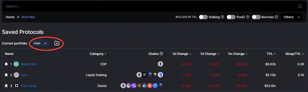
Staying up to date is one of the biggest problems in crypto, and is what we’re trying to solve here at Revelo Intel… but we can’t keep track of your portfolio for you. Luckily, the folks at DefiLlama have you covered with the watchlist that allows you to see stats for protocols you have saved. You can even make multiple portfolios to keep your saved protocols more organized!
This can help you stay up to date on protocols you have a position in, or maybe have just taken an interest in.
Use the Watchlist to quickly access information on a protocol’s TVL; you could use this information to decide if you need to add or edit any positions in your portfolio.
While things are bearish right now, the good times will return eventually. During the last bull run, many people used DefiLlama to keep track of protocols that maybe they didn’t have the most conviction in, but wanted to take advantage of a trading opportunity. This page can be a quick way to check up on protocols you’re interested in but are prepared to exit if you think TVL, capital inflows, outflows, or market cap warrant closing a position.
Use the Directory to access the official link for projects, as Google search results often include scam websites. Crypto is risky enough: no need to add scam websites into the mix!
Roundup provides the latest daily news. You can find links to:
Use this info to filter out the noise in crypto and avoid endlessly scrolling Twitter or browsing youtube.
Spend less time staying up to date, and more time using the information you consume to make the decisions that matter most to you.
This page allows you to see the latest trending contracts in your chosen timeframe. You can also sort trending contracts by # of transactions, tx growth, active accounts, account growth, gas spent, or gas spent growth.
This feature could be used to find contracts that have recently seen an uptick in activity, allowing you to find on-chain opportunities before others.

The Token Liquidity page provides 10 price quotes from 10 different DEX aggregators for the trade you input.

The table and chart provide you with information on how slippage increases were the size of the trade increase, so you know how much liquidity to deploy if you wish to swap a large amount of funds.
This page lets you see how much liquidity there is for a certain token, and how much would need to be bought or sold to move price X%… This is something that could come in very handy, especially considering the data is updated in real-time, which you can see if you look at the chart for a few seconds.
The DefiLlama Wiki functions as a community-maintained encyclopedia for crypto projects. Users can add pages for their favorite projects, or read summaries of other projects, just like Wikipedia but for crypto specifically.
It can be difficult to find reliable sources for crypto info, let alone sources with a consistent, easy-to-read format that doesn’t overcomplicate things.
You can use this wiki as a source to learn about an expanding number of protocols, and potentially add new information you think is important or useful, helping to make information more available to the crypto community.
The data on the wiki can be used to get an understanding of a protocol’s function and background. It can also serve as a gateway to access other resources to learn more if you are interested in using or investing in a protocol.

This page is primarily intended for people in the media who wish to get in touch with the DeFiLlama team: you can find their contact info and see what institutions use DeFiLlama, including CoinDesk, Goldman Sachs, and more.
You can also find their branding assets here.
The API Docs provide options to integrate DefiLlama’s open API. This could come in handy for people building algorithms for trading or market making, as it allows you to pull data on stablecoins, bridging, transaction volumes, fees and revenues, and many more instances that could be important for a system to use as input for decision making.
This page brings you to the docs, where you can learn more about the listing and maintenance process if you wish to list your protocol on DeFiLlama.
This tool is primarily used by researchers and journalists who want very in-depth information: most users can download data from individual dashboards via CSV export which is more convenient for their use cases.
DefiLlamas annual reports are in-depth analyses of the most important breakthroughs, sentiment shifts, innovations, and other events across the crypto landscape. Their 2022 EOY report is 37 pages long; it includes reporting on the most popular L1s and L2s, top categories like LSDs, Collateral Debt Positions (CDPs), and key moments such as the merge, and notable hacks. It comes complete with visuals and charts, providing data to support the points discussed.

Version 1.0 | May. 21, 2023 – Initial Release